Typographic Treats
2014-06-09

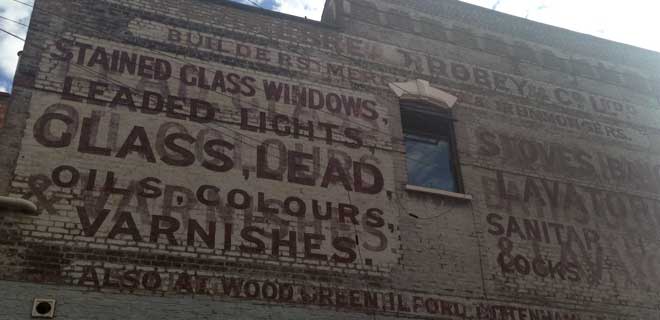
I decided to indulge myself this weekend in a double typographic treat by booking myself onto the Ghost Signs tours as well was the Type Tasting talk in Stoke Newington, as part of the literary festival taking place this weekend. I had heard previously a lot of good feedback about the tour, and it has been something I’ve wanted to go on for a while due to my interest in hand crafted typography.

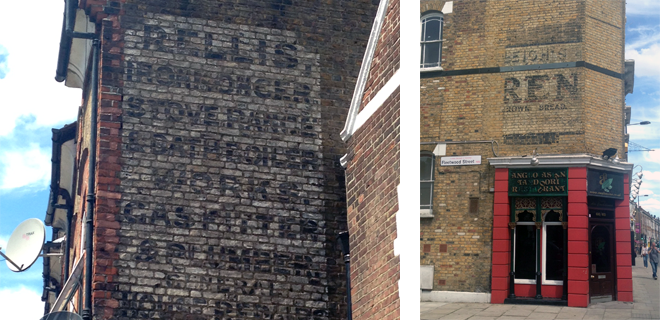
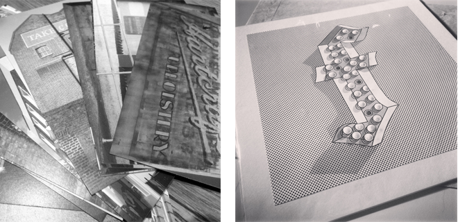
Sam, our guide, did not disappoint. His knowledge of the signs and their history was in-depth and well spoken about, and the two hours seemed to pass by very quickly with us visiting roughly fifteen signs in total. The signs varied from being barely visible to taking up the entire sides of buildings, and most seemed to be illegible but we were encouraged to decipher what they said. What I found most interesting was the photographs Sam brought along with him depicting some of the pieces back when they were created, meaning we could compare them to their present-day appearance. Considering some of these were over 100 years old it is impressive how well they have kept.
One question that was raised over the course of the walk was whether ghost signs are considered art or not? This was brought up after we were informed that before the Olympic Games the local council ordered that all graffiti in the area to be painted over as part of a clean up. A few ghost signs were included in this, but luckily they managed to be saved and preserved. Another point discussed was to do with how in places such as Bath and Cambridge the ghost signs are being redone, and whether this is good or bad? It is great to keep them alive and as pieces of art but at the same time you lose their originality and history? All very good questions to think about.
I don't wish to give too much away about the tour as I think this is a must see in London, and is a bit different to your usual tourist attractions. Not only is it for anybody who has an interest in ghost signs but also London history. You can find out when the tours are run here.
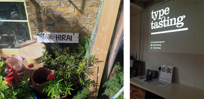
After a quick refreshment in Lazy Social, which has amazing iced coffee by the way, we head down the road to the chocolate factory where the Type Tasting talk was being held. These open studios were beautiful and right by the place I get my one shot paint from, sadly it was shut on a Sunday!

The talk I attended was run by Type Tasting, which is set up by Sarah Hyndman, who carries out a series of workshops and talks inspired by making typography accessible. They are well-known for their edible letter forms, creating various typefaces out of food and answering the question of 'what would this typeface taste like?'. She has created Comic sans out of sweets and popping candy, Helvetica out of water biscuits and Impact out of chilli chocolate!
We were taken through the basic history of typography; but showcasing it through the medium of ten album covers. It was strange to see that other than myself there were only a few others in an audience of about fifteen who were actually practicing designers, I imagine this was due to it being part of the literary festival. The talk was very engaging, asking us to participate in a music quiz and ending in chopping up letterforms to create a 'sex pistols' style quote at the end. Although I knew most of the things that were discussed I could see how this is a good way of teaching others about typography. Sarah spoke about the influence of typographic styles from various decades and how they had an influence on certain album covers, for example the AC/DC logo referencing black letter and taking a shock tactic of mimicking the typeface used for the Nazis, with Franz Ferdinand's album referencing Russian propaganda and breaking the grid.
At the end I spoke to Sarah briefly about sign writing and her work and also picked up a lovely neon sign print, inspired by the Neon Boneyard in Las Vegas. It glows in the dark! You can find out more about what they do and their workshops here.


